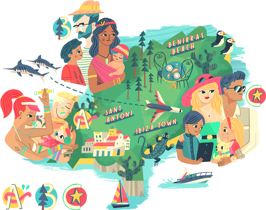
1. Use of Type or Text - Ivy Press (3), Ktistyna Baczynsk (1), Dan Berry (1)
- Cold colour used
- vector?
- some of these illustration (above) > limited colour scheme, no outline, shape and simplified.
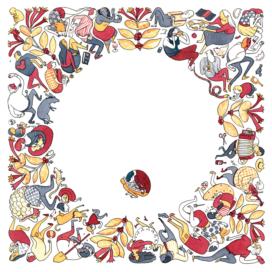
2. Simplicity of Image - Eleanor Davis (4), Ktistyna Baczynsk (1)
Lots of characters and simplified, limited colour used.
3. Attention to detail / skill / complexity
I like how Yoko Furusho use her imagination to create this above illustration.
Intricate detail + observational drawing by Maja Wrońska
- I love looking at illustration with lots of detail as I think they are amazing and interesting to look at but I do not think that I got the patience to create one > might try to create one tho.
4. Coceptual development, sketchbooks development work - Michael DeForge (1), Dan Berry (2), Mattias Adolfsson (1), Melissa Castrillon (1)
-
- I like how two pages interacting with each other supporting by illustrations
- These sketchbook illustrations make me realised that when you use your sketchbook, there are no limitation.
- Sketchbook scamps does not have to be refined or look finish.
5. Use of Media - Nate William (1), Stuard Kolakovic (1), Liam Barrett (1), Nicolas Kole (1), Habbenink (1)
- Each media produce different effects and look
- I like the top left as it reminds me of my tone of voice which are shape, vector and limited colour pallet.